Jigsaw is a company within Google — it previously existed independent of Google as an Alphabet company — that “forecasts and confronts emerging threats, creating future-defining research and technology to keep our world safer”.
What I think: It got easier to work with. I like that they could use the symbol alone and with the word, although it was like that before. It seems more balanced now. Before it was so heavy on the left side.
Logos are often used in different ways. Here's how it's used also:
What I think: There really wasn't anything wrong with the first logo. It's kind of interesting. Although maybe too literal. I do like what they've done with tying the circles in with the font they use, and putting them in other places in their branding.
Logos are often used in different ways. Here's how it's used also:
What I think: It was fun the first time. I don't know that it was worth the rebrand. A little expensive to rebrand something that almost stayed the same. Why not just use the fun colors with it? Make the black, so it can be lots of colors?
Spotinst to Spot - They really didn't have much on their site, for this logo.
What I think: A name change can be really risky. People get to know you, then poof don't know you at all. The first logo looks kind of forced with that "t", and the second logo I like the spots, but hate the "T" still.
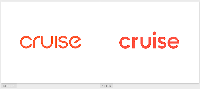
What I think: I like both logos really. There isn't anything I hate about them, and they aren't wow either. I do think it's cool that the "c" is used as a symbol. I heart the way they picked their colors by using images around the city.
Comment on a logo you like the transformation on, and a logo you don't in the comment section of this blog post.


I don’t like Oios design at all. It almost looks like a scribble, and unless you were familiar with the company you might not even know what it’s supposed to mean. -Alyna
ReplyDeleteI really like the jigsaw company rebrand. It looks a lot simpler and more professional than the original but maintains the same idea of the jigsaw piece. - Maddie
ReplyDeleteI like the Pollination new logo. It looks a lot cleaner and more pleasing to the eye and the circles are real neato. -Haily
ReplyDeleteI like the Oio logo rebrand. It is a lot more consistent width wise and looks cleaner than the first one. -Emma
ReplyDelete